Electronic Document Accessibility Regarding Microsoft Powerpoint
As another article in our series about creating accessible documents, we are going to focus on how to properly structure your Powerpoint presentations.
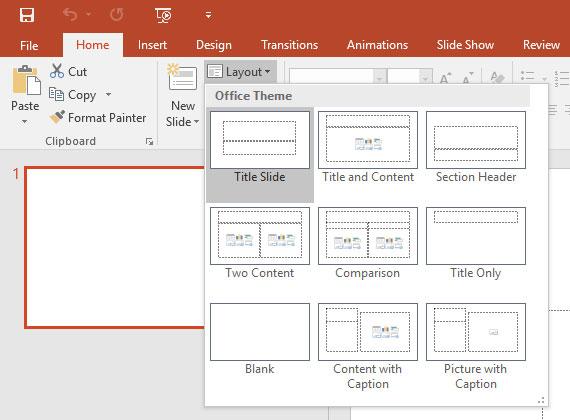
Use Slide Layouts
When creating slides and the structure of your presentation, be sure to use layouts included in the program. This will create foundation in the document that makes sure proper order, headings and lists are used.

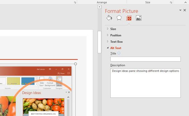
Alternative Text for Images
Be sure to give images alt text so that a screen reader can give a proper description. It’s done the same way as it is in a Word document. Click on the photo, chose Format, then the Size & Properties icon, and then Alt Text.

Tables
When making tables, be sure to use a clear structure and headers in order to allow for easy navigation.
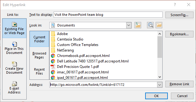
Links
When you add a link to a Powerpoint slide, Powerpoint will automatically make it a hyperlink. But in order for it to be accessible, there is a couple things you should do. Right click on the hyperlink to edit it, then change the text to display to what the title of the page it goes to should be so that it’s more meaningful.

For more tips on how to make your Powerpoints more accessible, be sure to check out the cheat sheet from the National Center on Disability and Access to Education website. And be sure to keep an eye out for our final document about Adobe PDF accessibility.
EDIT: Microsoft replied to our tweet of this article with these additional resources for you regarding Powerpoint:


